字体设计基础(1)视觉均衡
100% practical. Sketches have been made to explain some basic issues in type design during the workshops. They get used to point out some problems which raise while creating a new typeface. Only some foundations are shown, no deep sophisticated details.
(写在前面)
100%实用。这一系列关于字体设计的讨论文章来自typeworkshop.com,每篇文章都配有手绘的插图,以阐明字体设计的一些基本事项,指出设计新字体时可能会遇到的一些问题。这里只讲述一些最基础的东西,未涉及复杂的技术细节。
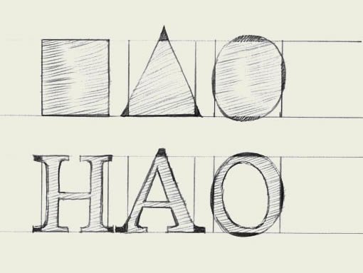
Same size for all! To optically align all characters on a line, they cannot not have exactly the same mathematical height. For example the triangle on this drawing has to be higher than the rectangle. If this is not the case, the triangle will for sure look smaller than the rectangle. While creating a typeface, you want all the letters to have the same height.
为了让所有字符在视觉上对齐,它们就不能采用同样的物理尺寸。比如说,下图中的三角形的高度就必须大于矩形。否则,三角形看起来就要比矩形小很多。 而我们在设计字体的时候,往往想给它们定义同样的高度。
Also round forms have to exceed the baseline to be optically the same. If the circle would have exactly the same mathematical height as the rectangle, it would look smaller than the square. This doesn’t only count for basic forms like triangles, circles and squares. It’s essential in type design, because they apply to every single character in a typeface. Then it even doesn’t matter if you’re designing a latin, cyrillic or greek font. It’s a basic principle for any kind of shape.
同样的 ,为了使圆形看起来和矩形同样大小,圆形就必须超出基线。如果圆形和矩形物理尺寸一样,圆形看上去就会比矩形小。这一规则不仅仅适用于三角形、圆形、方形这样的基本形状,这是字体设计的基本原则,整个字体中的所有字符都适用这一原则。不管你设计的是拉丁字体、还是斯拉夫或者希腊文字体,这是所有形体都必须遵循的基本准则。
(2)术语
Type terminology. Communication during the design process is much easier when using basic terminology of type. Here are a couple important ones, which will help to bring the conversation a bit further than ‘yeah, that there, that little black thing.’ The counter of the ‘e’ can also be called an ‘eye’, but there are many more terms. If you want to know them all, go to the library or browse–the–web.
使用字体的基本术语,会让设计过程中的交流变得非常容易。这里是一些基本的术语,让你的交流能够更深入,而不是“嗯,那里,那个,那个黑色的小玩意……”小写e的”字怀”(“字谷”)有时候也被称为是字“眼”,如果你还想更全面的了解其他术语,可以去图书馆,或者是参考下面的网络资源。(译注:很遗憾,原文中链接的一些资源已经无法访问了。但我们可以用google找到其他的资源。这些术语很重要,如果你希望阅读西方的第一手的字体设计研究资料,这是必须跨越的一关。但目前在国内的设计界似乎还没有一个统一的翻译,不少书籍的翻译都是各行其是,让读者也无所适从。有时间我会找一篇比较完整的来翻译。)
http://www.adobe.com/type/topics/glossary.html
http://gmunch.home.pipeline.com/typo-L/faq/anat.htm
http://www.google.cn/search?client=aff-cs-maxthon&ie=UTF-8&oe=UTF-8&hl=zh-CN&q=typography%20anatomy&um=1&sa=N&tab=iw
(3)流线型
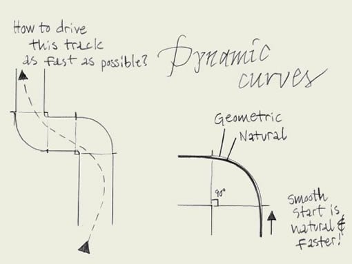
Fluent shapes. Designing type is like driving a car. If you drive a car, you always take the curve in a natural way. If you draw a curve (of a character) on paper, this is exactly the same. The curve starts smoothly, never out of a sudden. While driving a car, you don’t start turning the wheel when you are already in the beginning of the curve. A while before you arrive in the curve you anticipate by leading your car gently in the right direction. Think about driving a car when you are sketching type on a paper.
流线型。设计字体就象开车。你在开车的时候,总是会以自然的曲线过弯。当你在纸面上绘制一条曲线(或是字符)的时候,也是同样的道理。曲线平滑的开始,而不是陡然出现。开车时,你不会在已经到达了弯道口之后才开始打方向盘,而是在你预计即将进入弯道的时候,就开始慢慢的将你的车引入正确的方向。当你在纸上画草图的时候,多想想你是怎样开车的。
(下面有图片。)
图片上的文字:
标题:动态的曲线
左:怎样才能最快的驶过这条弯道?
右1:几何曲线
右2:自然曲线
右下:平滑的开始转向,更自然,更快速!
(4)书法原型
点击放大
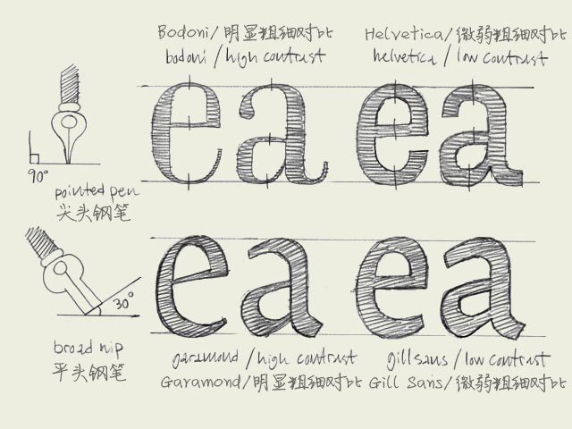
Calligraphic origin. The characters on the top line have a different construction than the characters on the bottom line. They have a different calligraphic origin. It doesn’t matter if a typeface has serifs (like Times New Roman) or not (like Arial). It’s about the original way they where constructed.
图中上下两行字母有着不同的结构,它们来源于不同的书法原型。不管这种字体是衬线字体(如Times New Roman)还是无衬线字体(如Arial),它们的架构都源于它们的书法原型。
The characters in the top line are constructed with a pointed pen (calligraphic tool). The contrast is caused by changing the pressure on the pen, not because of the form of the pen. Bodoni is one example of this, but also sans serif faces like Helvetica have this origin. The thickest part will be (mostly) totally vertical. From this perspective there is no difference between Bodoni and Helvetica. They both have the same construction. Only the contrast varies.
上面一行的字体的书法原型是一种尖头的书法钢笔。其笔画的粗细对比是通过改变笔压来实现的,而与笔尖本身的形状无关。Bodoni字体就是一个例子,但是象Helvetica这样的无衬线体也是来源于此。笔画最粗的部分几乎都是垂直的。从这个角度来看, Bodoni和Helvetica是同出一辙的。它们的架构是一致的,只是笔画的粗细对比有区别。
The characters in the bottom line have a origin which is derived from the broad nip. The calligraphic pen itself has a thick and a thin part. The contrast in the type is made because of the form of the pen, not because of the pressure. You slant the pen with an angle of 30 degrees on the paper. In that way your thickest part of a character will not be on a vertical direction, but will be on an angle. Also the thinnest part will not be on the most horizontal parts. Typefaces like Garamond and Minion have this kind of construction. But also sans serif faces like Gill Sans have a construction which is originally derived from the broad nip.
下面一行字体来源于一种笔尖扁平的钢笔。这种书法钢笔正面宽而侧面窄。字体的笔画粗细是由于钢笔本身形状的差异造成的,而不是笔压。你书写的时候笔身是倾斜的,和纸张形成30度的倾角。因此笔画最粗的部分就不是垂直方向的,而是有一定角度的倾斜。同样的,笔画最细的部分也不是位于水平方向上。Garamond 和 Minion 字体就是这种结构。但象Gill Sans 这样的无衬线字体也同样是起源于这种笔尖扁平的钢笔。